Thursday, July 23, 2009

Assignment 6

How Things Work

We were supposed to design an infographics for assignment 6. What is an infographic? It is to transform a set of complex information into a very simple visual representation such as a map. Thus, an MRT map is actually an infographic! To think that we've been looking at infographics in our daily lives as well as our textbooks but yet we didn't know what we've been looking at!

I wanted to do an infographic on how to operate a washing machine but I thought it was quite silly so I decided to on global warming instead. However, as Saving Gaia is a big notion nowadays, I thought I should work on that topic instead. Therefore, from Saving Gaia, I narrowed it down to the 3 Rs - reduce, reuse and recycle.

I wanted to educate people how to reduce, reuse and recycle by showing them examples and hence, my infographic looks like this,


I actually took 2 pictures which is the picture of the pink tin with nail polish and the ink cartridges. I did some effects on the ink cartridges to make it look like it was hand drawn.

However, during tutorial, Jing pointed out that my infographic does not really fit her requirements because I didnt show any stages of development. (sigh) However, it was brought up by my classmates that I could show how to reduce, reuse and recycle in a normal day of our life so that there will be some stages of development.


Update

I decided to continue with my saving gaia notion and therefore I came up with an infographics on what are the thiings you can do in a day to save the earth. Firstly, it is to take the public transport or bike to your destination instead of taking the car. Also, take more vegetables and less meat because meat production contributes to the greenhouse effect. Next is to work on energy conservation by turning off applicances at main power point after usage and also to use recycled paper. Recycling should be part of our lives and if we have anything to recycle, we can put it in the recycling bin. Water conservation is essential too, and an example to save water would be to use buckets of water instead of a hose to wash a car. Lastly, it is to set your air-con temperature to 25 degrees.

I didnt want to use all square boxes because it might look abit rigid therefore I used an arc to create the effect. As the infographics background is white, I decided to add colour to the clocks so that the infographic wont look that plain.


Thursday, July 16, 2009

Assignment 5

Your Notion of Colourful Asia

This time round, the assignment is to create a postcard that has to do with Asia. Jing said to avoid using costumes, food and landmarks. The first thing that came to my mind was Peking Opera and the mask that they used. Initially, I wanted to create the mask using pictures or illustrations that is related to Asia such as the Great Wall of China, the different races in Asia, etc... However, I scrape that idea because I realised I don't have pictures of my own with those stuff that I wanted to make up the mask as I thought using pictures to form a collage in a shape of a mask would be prettier as compared to just drawings of mine to form the collage.

Being a peranakan and I think not many people know about peranakans until The Little Nyonya came about, but I still wanted to stick to a peranakan theme as it's my heritage! I didnt want to use cuisine cos its common plus it was widely portrayed in show so I decided to use a peranakan house in my postcard. I like peranakan houses because they are just so beautiful and its symmetrical. Whatever that in on the left will be on the right as well. I think this is actually a unique feature of a typical peranakan house. :)

I decided to place two people there, one being a Chinese and the other being a Malay. It's because of these two races inter-marriage, that's how peranakans came about and that is why I portrayed one as a Chinese and the other as a Malay. They are wearing traditional Chinese costumes for marriages as the girl is wearing a cheongsam and the guy is wearing the changsan.

Also, Infernal Affairs, the movie is considered a hit in Asia so much so that Hollywood actually bought the rights and did a remake. Therefore, I add in a little bit of "pun" by using the Chinese characters of Infernal Affairs to form the signboard. This has nothing to do with Peranakans but but it is indeed an achievement for Asian/Hong Kong movies and I'm an avid fan of that movie too.


As I was supposed to play with colours, I decided to try a green theme, a gloomy theme, a nyonya theme, a blue theme. For the last two thumbnails, I was playing with the speaking and shouting colours.

Ultimately, I decided to go for the nyonya theme which is the picture shown below.


During tutorial, there were suggestions that I could put like the kids wearing the kebaya in between the two figures in my picture to show a Peranankan family and also because the entire thing is symmetrical, I could make something in the picture out of place in order for it to look more dynamic. Also, I could make the figures overlap the front of the house. I also drew the walls wrongly as people were mistaken that the scene is in the house instead of the entrance of the house. I was thinking of adding some text to the back of my postcard about Perankans and how they came about in order to "educate" the buyers of the postcard.

Update


Added a pair of shoes outside the house to give a "cheeky" feeling as it disrupts the whole "systematic" feeling in the postcard.


Tuesday, July 14, 2009

Assignment 4

iN2015

Assignment 4 is to design a poster and boy, it was a real challenge! I was lost initially as I wasn't sure what I can do but after emailing Jing, my doubts were cleared. The objective of my poster is to create awareness to a target audience of secondary school students and maybe upper primary students. I wanted to inform them that through iN2015, education would be actually made easier and you can actually learn on the go. This idea is actually adopted from the IDA iN2015 video whereby the little boy is actually at the zoo asking his teacher about the animals. I thought that this image would be the most effective because I was thinking of putting the little kid in the museum or a shopping mall but the zoo is like more nature-like and it is out in the wild without technology.

I actually drew a giraffe out and asked my brother to pose for me before taking picture of him. The little picture of the teacher is really my teacher's photo which I took last year and this is to portray him like talking to a teacher in the zoo. I wanted to add in the word, "iN2015" below the header - "empowering learners. through infocomm." However, I thought that it would be to crowded on the top and I wanted to "balance" the poster, therefore, i put "iN2015" at the bottom which was bold and in red to highlight.


After printing, I realised that some fonts are actually quite small and cannot be seen especially the words at the bottom while the blue used for the header didn't stand out so I have to work on it.

Moreover, the comments given were that my brother was pretty out of place and I could draw more animals crowding over him to give a pretty comical effect. Another idea would be from the laptop screen, I could show an image of a school to indicate that the school is actually digitialised.
Update


Made changes to the poster by making some animals crowd over my brother. Also, I got rid of the word "Singapore Zoo" because we can only find animals in the zoo! Added a bubble text to indicate that the student is actually speaking to the teacher in the zoo and it is literally learning everywhere you go.. Changed some colours and fonts as well so that the words are more visible and it is easier to read.

Monday, July 13, 2009

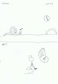
Class Exercise C

The first thing that comes to my mind for slow would be either a tortoise or a snail and for halt it would be the hand telling you to stop..

Assignment 3

U C what I C

I am supposed to tell a story in 8 pictures in this assignment. Came up with many storyboards and boy, was it difficult! Some of my stories were either shorter than 8 pictures or more than 8 frames. However, I managed to come up with one.


I applied what Jing taught during lecture whereby I was taught the different kind of shots and camera angles. Therefore, in my first frame, I wanted to portray the character in a majestic and almighty light because she is very confident and proud of herself, hence, using a low angle. The rest of the shots are at eye level angle and I used quite a bit of mid shot and close up shots. I like the 7th picture alot because I took it with the tree in it. I thought it was quite "artistic". In the 3rd shot, I wanted to add the gush of wind as someone is actually running faster than her. After adding it in, I thought it looked weird because the photo is actually speaking and it's real whereas we would normally use those lines as gush of winds in comics. Therefore, I removed it.

Picture 1: She is very proud and confident of herself, thinking that she's the fastest runner around.
Picture 2: She goes running.
Picture 3: Someone runs past her.
Picture 4: She is shocked that someone actually ran past her when she's the fastest runner!
Picture 5: She decided to run faster than the person who ran past her.
Picture 6: She's exhausted despite trying running with all her might and she still cannot catch up with the person.
Picture 7: The person is chasing after the bus.
Picture 8: She's annoyed that she was "competing" against someone who was running after the bus.

Had tutorial and the class pointed out that there is a slight problem in my story whereby I should show the person who's chasing after the bus in the 2nd frame and behind the main character. Also, I should show how she didnt manage to catch up with the person and was exhausted.

Update


Made some changes to the first and second frame by showing that she is really proud that she's a fast runner because she has won medals. In addition, in the second frame, we can now see the second person running behind her. In the third frame, then the second person ran past her and the story is the same..

Assignment 2

Less is more

This assignment is to create one pictogram for NUS community and this pictogram will be placed in the NUS campus.

Step 1: Degree of Abstraction

I decided to use an escalator as I thought NUS needs it really badly since we have so many stairs and its really tiring to climb up the stairs especially when you are running for the next class!

To my horror, I was on the wrong track all the while because I thought we were supposed to come up with a pictogram that will help to improve the school! Gosh! Therefore, I decided to use a stairs since its slightly similar to my escalator example.

Update!

I decided to use my original idea which is to use create a pictogram of lifts. This is because I realised that as a freshie, I didnt know where the lifts were located and I didnt know until my friends told me about it. Thus, I've been climbing stairs when I could take the lift up! This could be due to the fact that there are not many lifts in NUS. I think this lift pictogram could be place in areas whereby there are alot of stairs such as the Business Library whereby a pictogram could be placed at the stairs there to indicate where the lift is so that people do not have to climb up all the stairs to get to the Business Canteen but actually take the lift up and then walk straight to the Business Canteen.

I decided to use the 5th picture as my prototype because with the up and down buttons, people would be able to identify it as a lift whereas for the last picture, it can be seen as 2 planks of wood that are placed side by side. Thus, it looks like that:

Friday, July 3, 2009

Assignment 1b

Me, Myself and I

Assignment 1b is to develop a prototype from one of th
e two rough from assignment 1a.


We had a comments/critique session during tutorial and I took all the comments into consideration.

Firstly, music was pretty common but I thought I should continue with it because I love music and as Jing mentioned, a good piece of work takes time to refine. :D

Secondly, someone mentioned that my distorted guitar looks abit artificial because we are all used to looking at a normal guitar. I thought that was pretty true and decided to come up with something new. Therefore, I decided I should use my mouth as a 'C'. Moreover, when I am in front of strangers, I would not talk at all or speak minimally but I can get really loud and noisy when I am with people I'm close to as well as things that I love. Since I love playing the guitar, I will be singing and be loud. Therefore, my mouth will be open most of the time!

Thirdly, I decided to use a guitar pick to form the 'A' because I thought the wires should not take much most of the lettering of my name.

Finally, 'SS' would be the wires to the amplifier.

We had another tutorial and I received more comments about my work. It's pretty static and "strict" especially when I'm trying to convey a "I'm-so-happy-playing-the-guitar-mood" because the person and the amplifiers are all straight. Furthermore, my 'C' and 'A' cannot be seen too clearly after printing, thus, I have decided to play with the positioning of my character and other objects around. My wires are still very much forced and I should make them look more natural. I also received more ideas on how to form my 'C' and 'A' and I will work on them to see if it looks nice.

Update


Made some changes to the above diagram by making the mouth bigger, the wires less intentional, tilting the amplifier and the legs are not straight. This is to create a more dynamic picture but it still does not portray the happiness feeling that I want to portray. In addition, the readability of my name is still an issue because its not that easy to read.

Therefore, i decided to change the picture and changed to the above picture by using the 'C' as part of the guitar and the 'A' integrated in the guitar. This has a happier feeling however, this is not a girl which is not me!

Therefore, I changed the person to a girl! Also, I changed the colours to give a happier feeling by using brighter colours!